Alcohol Consumption
Where Do People Drink The Most Beer, Wine And Spirits?
In this project, realized with my group at London Business School for the course “Data Analytics for Finance”, we will explore a dataset on the consumption and production of alcohol.
# Loading the data
library(fivethirtyeight)
data(drinks)
We’ll check first for any missing variable. Fortunately, our dataset is complete and we have no missing values.
# Using glimpse and skim to understand the dataframe
glimpse(drinks)
## Rows: 193
## Columns: 5
## $ country <chr> "Afghanistan", "Albania", "Algeria", "...
## $ beer_servings <int> 0, 89, 25, 245, 217, 102, 193, 21, 261...
## $ spirit_servings <int> 0, 132, 0, 138, 57, 128, 25, 179, 72, ...
## $ wine_servings <int> 0, 54, 14, 312, 45, 45, 221, 11, 212, ...
## $ total_litres_of_pure_alcohol <dbl> 0.0, 4.9, 0.7, 12.4, 5.9, 4.9, 8.3, 3....skim(drinks)| Name | drinks |
| Number of rows | 193 |
| Number of columns | 5 |
| _______________________ | |
| Column type frequency: | |
| character | 1 |
| numeric | 4 |
| ________________________ | |
| Group variables | None |
Variable type: character
| skim_variable | n_missing | complete_rate | min | max | empty | n_unique | whitespace |
|---|---|---|---|---|---|---|---|
| country | 0 | 1 | 3 | 28 | 0 | 193 | 0 |
Variable type: numeric
| skim_variable | n_missing | complete_rate | mean | sd | p0 | p25 | p50 | p75 | p100 | hist |
|---|---|---|---|---|---|---|---|---|---|---|
| beer_servings | 0 | 1 | 106.16 | 101.14 | 0 | 20.0 | 76.0 | 188.0 | 376.0 | ▇▃▂▂▁ |
| spirit_servings | 0 | 1 | 80.99 | 88.28 | 0 | 4.0 | 56.0 | 128.0 | 438.0 | ▇▃▂▁▁ |
| wine_servings | 0 | 1 | 49.45 | 79.70 | 0 | 1.0 | 8.0 | 59.0 | 370.0 | ▇▁▁▁▁ |
| total_litres_of_pure_alcohol | 0 | 1 | 4.72 | 3.77 | 0 | 1.3 | 4.2 | 7.2 | 14.4 | ▇▃▅▃▁ |
Let’s now see which 25 countries drink the most beer.
# First we subset the 25 that drink most beer and then we plot in descending order
countries_25beer<- drinks %>%
  top_n(25,beer_servings)

#constructing graph
ggplot(data = countries_25beer,
       aes(
         y= reorder(country,beer_servings),
         x=beer_servings))+
  geom_bar(stat='identity')+
  labs(x = "Consumption of Beer (in Servings)",
       y ="Countries",
       title = "Top 25 Countries by Beer Consumption")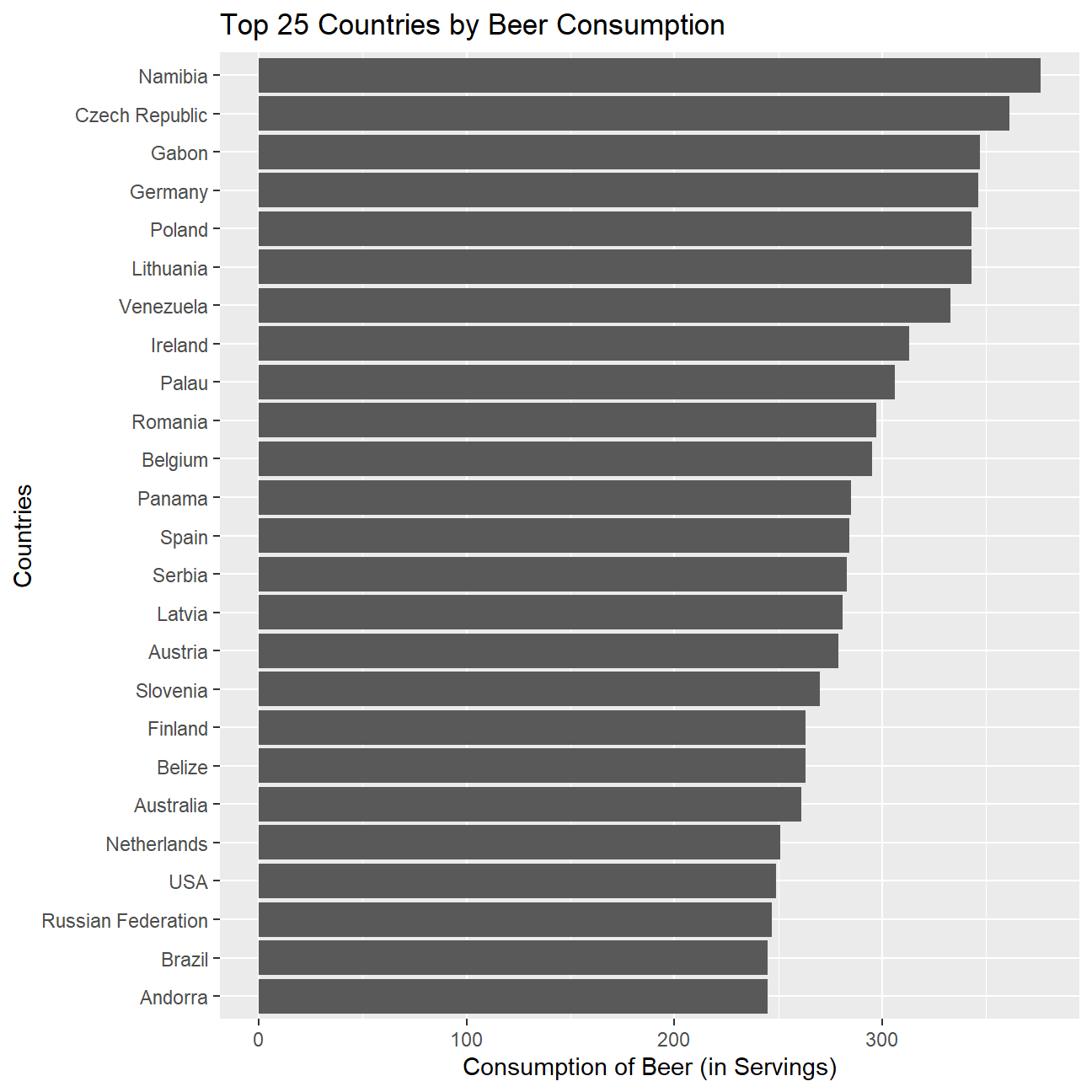
But what about wine?
# First we subset the 25 that drink most wine and then we plot in descending order
countries_25wine<- drinks %>%
  top_n(25,wine_servings)

#constructing graph
ggplot(data = countries_25wine,
       aes(
         y= reorder(country,wine_servings),
         x=wine_servings))+
  geom_bar(stat='identity')+
  labs(
    x="Consumption of Wine (in Servings)",
    y="Countries",
    title = "Top 25 Countries by Wine Consumption")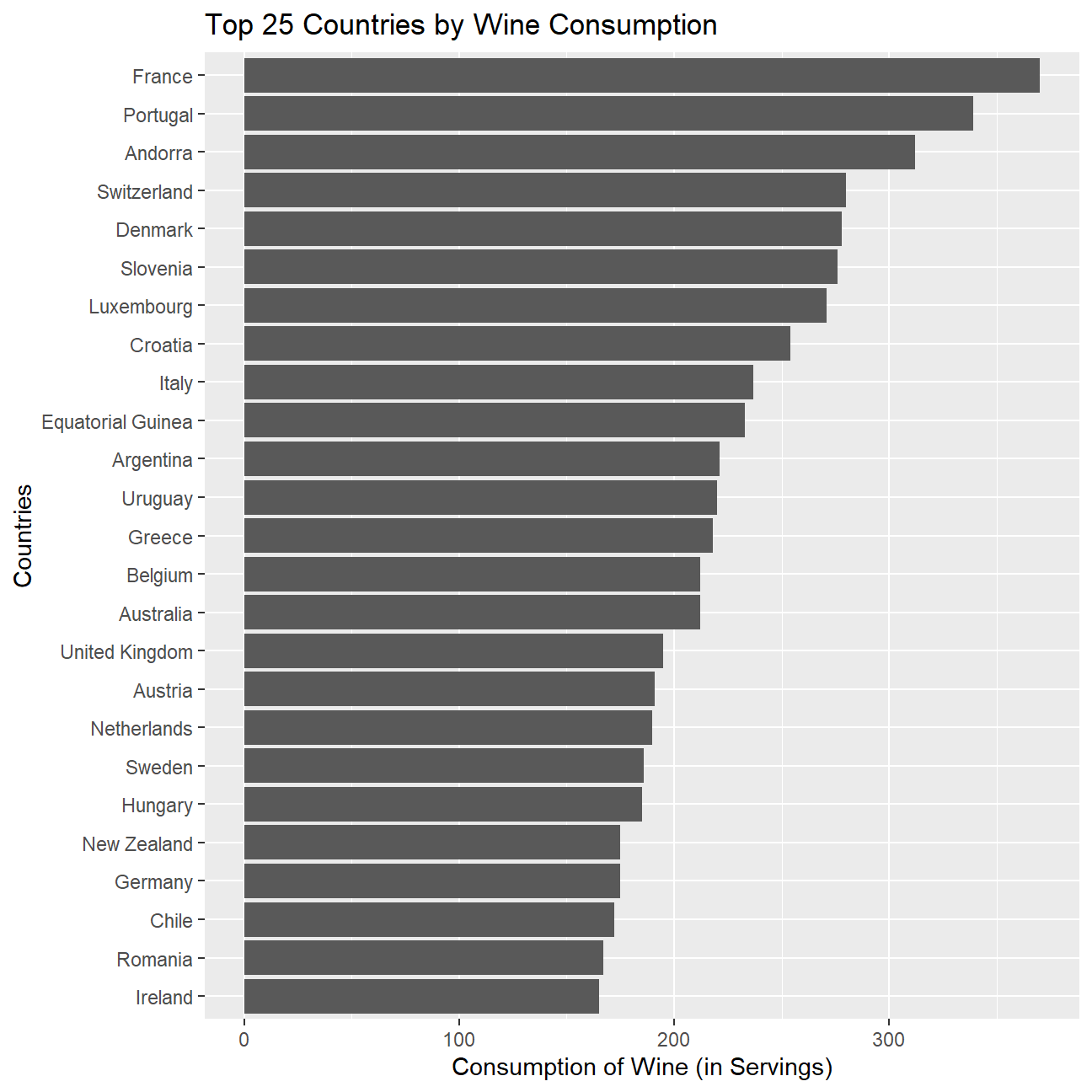
Finally, we can also see for the 25 countries drinking the most spirit.
# First we subset the 25 that drink most spirits and then we plot in descending order
countries_25spirit<- drinks %>%
  top_n(25,spirit_servings)

#constructing graph
ggplot(data = countries_25spirit,
       aes(
         y= reorder(country,spirit_servings),
           x=spirit_servings))+
  geom_bar(stat='identity')+
  labs(
    x="Consumption of Spirit (in Servings)",
    y="Countries",
    title = "Top 25 Countries by Spirit Consumption")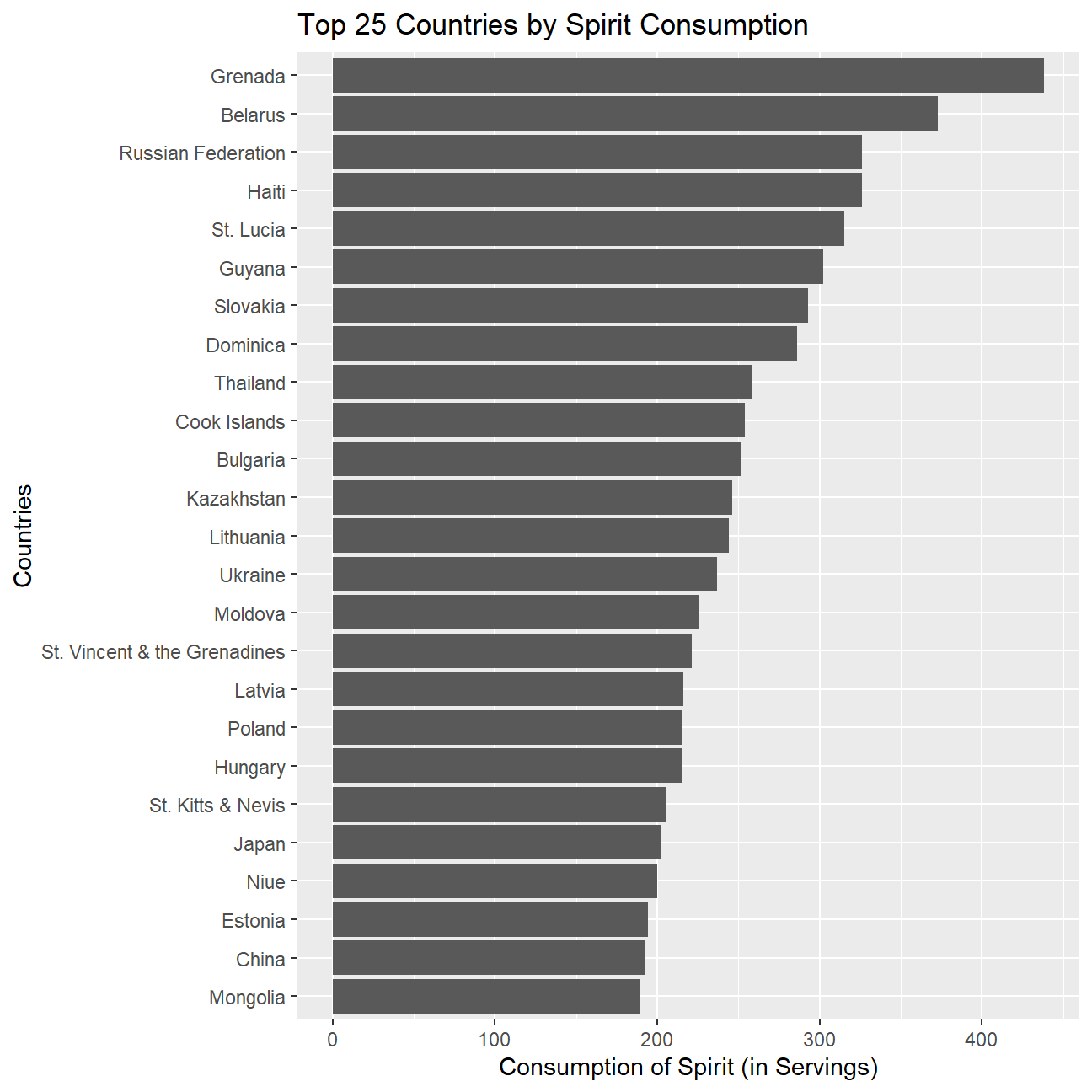
Looking at these graphs, we see that in countries like Namibia and Czech Republic, in which this drink is part of the day to day life and culture, the consumption is much larger than in other countries in which these drinks are seen more as recreation.
In addition to that, we can also see a relation between the production of alcohol beverages and their consumption. For example, France and Portugal, two of the largest producers of wine in the world, are at the same time top consumers of wine.